Bleed- what is bleed? Bleed is a term used for print advertising that extends all the way to the edge of the page with no margin. Magazines charge a premium for the bleed which is usually 15%.
Why do we need bleed? We need it because it’s very difficult to print exactly to the edge of the paper/card so it’s necessary to print to a slightly larger area than needed and then trim down the paper to the required finished size. Background images and fills which are intended to extend the most extended beyond the trim line to give a bleed.
How will I use bleed in my magazine? I will display bleed in my magazine by creating an extended section added onto the page.
Copy- an imitation or reproduction of an original for example a duplicate.
Strapline- a sub heading in a newspaper, magazine or any advertisement
I will use a strapline in my magazine to grab the attention of readers who like the same music as my magazine.
Tagline- an often repeated phrase usually associated with an individual, organisation or product. (A slogan) I will use a tagline in my magazine to be cleaver and make my magazine stand out from the others.
Pull Quote- a significant passage in an article that is quoted and used for drawing attention to its source. The pull quote will be used when I’m doing my magazine when an article leads on.
Bleed- what is bleed? Bleed is a term used for print advertising that extends all the way to the edge of the page with no margin. Magazines charge a premium for the bleed which is usually 15%.
Why do we need bleed? We need it because it’s very difficult to print exactly to the edge of the paper/card so it’s necessary to print to a slightly larger area than needed and then trim down the paper to the required finished size. Background images and fills which are intended to extend the most extended beyond the trim line to give a bleed.
How will I use bleed in my magazine? I will display bleed in my magazine by creating an extended section added onto the page.
Gutter-a gutter is the middle of the page where two pages are separated. I will use a gutter to separate two pages from each other and also use it as a margin for the text on my double page.
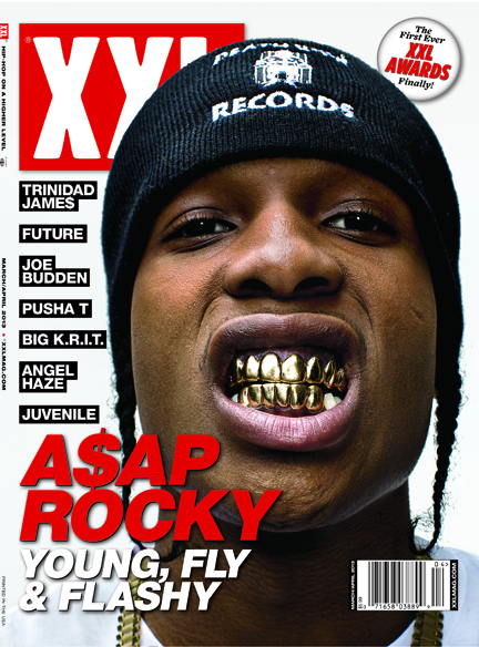
Pug- not commonly used in England however it’s the when the corner of the page is covered it usually has a buzz word inside of it. I’d use this on my front cover of my magazine because it would give you the incentive to open it.
Copy- an imitation or reproduction of an original for example a duplicate.
Strapline- a sub heading in a newspaper, magazine or any advertisement
I will use a strapline in my magazine to grab the attention of readers who like the same music as my magazine.
Tagline- an often repeated phrase usually associated with an individual, organisation or product. (A slogan) I will use a tagline in my magazine to be cleaver and make my magazine stand out from the others.
Pull Quote- a significant passage in an article that is quoted and used for drawing attention to its source. The pull quote will be used when I’m doing my magazine when an article leads on.
Pug- not commonly used in England however it’s the when the corner of the page is covered it usually has a buzz word inside of it. I’d use this on my front cover of my magazine because it would give you the incentive to open it.
Gutter-a gutter is the middle of the page where two pages are separated. I will use a gutter to separate two pages from each other and also use it as a margin for the text on my double page.